Understanding Gauge Charts and How to Use Them
A gauge chart is a type of chart that is used to visualize data as a percentage or as a proportion of a whole. Gauge charts are often used to show progress towards a goal, such as the progress of a project or the percentage of a goal that has been achieved. Keep reading to learn more about a gauge chart and how to use it.
What are gauge charts?
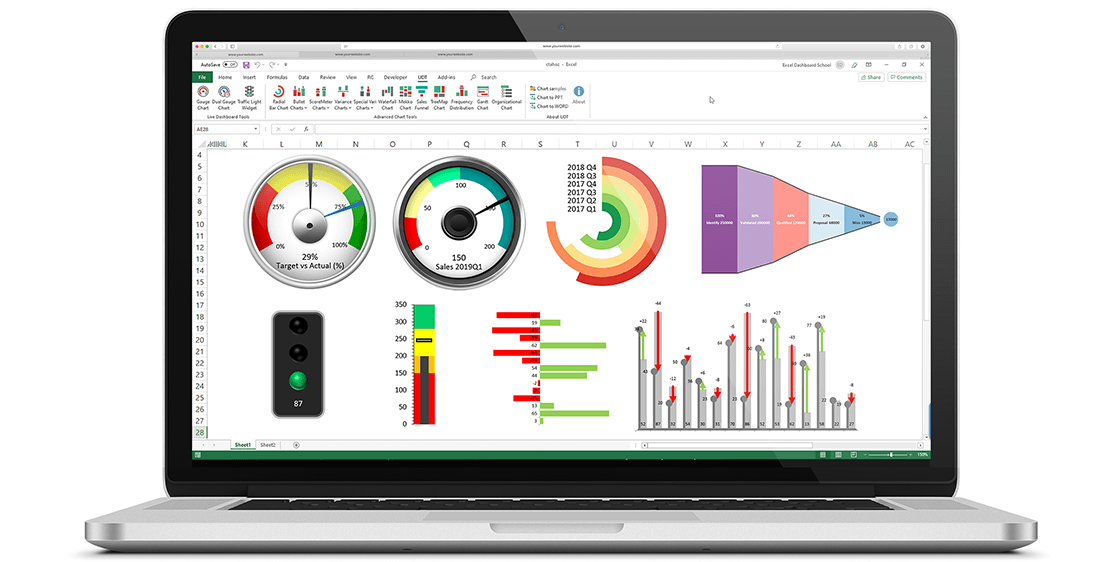
Gauge charts are graphical representations of values that change over time. They are similar to dials or meters on machines, where the needle or pointer moves to show the current value. Gauge charts are commonly used to show performance or progress towards a goal. For example, you might use a gauge to show how close you are to meeting a sales target or how much progress has been made on a project. Gauge charts can be used to show a single value or to compare values between two or more items. They can also be used to show a trend or the change in a value over time.
The most common type of gauge chart is the radial gauge. This type of gauge has a circular chart with a radial scale and a needle or pointer that moves around the circumference of the chart. Other types of gauge charts include linear gauges and thermometers. Linear gauges are similar to radial gauges but have a linear scale instead of a radial scale. Thermometer gauges are similar to radial gauges but have a thermometer scale instead of a radial scale.
The vertical axis on a gauge chart represents the magnitude of the quantity being measured, and the horizontal axis represents time. The points plotted on the graph shows how much has been achieved at different points in time. Gauge charts can be used to track anything from daily sales totals to project deadlines.
How do you read a gauge chart?
The key to reading a gauge chart is understanding what each segment of the graph represents. On most gauge charts, there will be three main segments: “above target,” “on target,” and “below target.” Sometimes there will also be a fourth segment labeled “not met.” Each segment usually has its own color, making it easy to distinguish them at a glance. In general, you want as much of the graph as possible to fall within the “on target” and “above target” segments; if too much falls within the “below target” or “not met” segments, then corrective action needs to be taken.
Each point on a gauge chart typically corresponds with an actual value; for example, if there are ten points plotted on a graph, that means ten values have been measured at different times. You can usually find this information in the legend located somewhere near or below the chart. If you want to know more about any specific point on the graph, simply hover your cursor over it, and information about that point will appear in a tooltip box.
What are some uses for a gauge chart?

Gauge charts are a great data visualization tool for understanding any KPI and can be used by businesses in a number of ways. One way is to use them to track actual results against targets. This can help businesses to see how they are performing and whether they are on track to achieve their targets. Gauge charts can also be used to track variances. This can help businesses to identify where they are having problems and where they need to make changes.
Another way that businesses can use gauge charts is to track progress. This can help businesses to see how they are doing relative to where they want to be. Gauge charts can also be used to track goals. This can help businesses to see how close they are to reaching their goals and where they need to make changes in order to reach them.
Gauge charts can be a very valuable tool for businesses. They can help businesses to track performance, identify problems, and track progress. Gauge charts can help businesses to achieve their goals and improve their performance.
A Gauge Chart is an important data analysis tool because it can help you check a specific data point quickly. It can also help you make decisions based on the information the gauge is providing about a single data value. Gauge charts are important to taking the pulse of a situation and providing a key piece of the larger data picture.
Personal contact info – slikgepotenuz@gmail.com
Permanent Address :- Montville, NJ
CEO and co-founder at Cloudsmallbusinessservice.com